Understanding
Packaging is the science, art and technology of enclosing or protecting products for distribution, storage, sale, and use. Packaging also refers to the process of designing, evaluating, and producing packages.
Objective
Objective
Physical protection
Barrier protection
Containment or agglomeration
Information transmission
Marketing
Security
Convenience
Packaging design require considerig all the above mentioned aspects of a good packaging.
Along with these chahracteristics two more aspects namely promotion and advertisment are also incorporated in the packaging design. It is done in such a way that packaging is also a product with alternate use to it.
Needs to have
Package Interaction
Guide consumers to discover layeres microinteractions
designed into the packaging.
Audible
Higher pitched retail packaging can lower the perceived
product value.
Haptic
Redundant hand positions required to open the packaging
reduce perceived product value.
Tactile
Textures in packaging can provide a rooted heritage feel
to a new brand.
Anticipation
Create at leat one brand appropriate moment of pause
after the initial opening of the pack which is intriguing
for the consumer.
Sustainable
Sustainable packaging is the development and use of packaging which
results in improved sustainability. This involves increased use of life cycle inventory (LCI) and life cycle assessment (LCA) to help guide the
use of packaging which reduces the environmental impact and tecological footprint. It requires more analysis and documentation to look at the package design, choice of materials, processing, and life-cycle. Here for Apnapun the material choice and the designing is an attepmt condering the above mentioned aspects of packaging.
Market
As observed according to the platform of selling the product i.e. digital and offline the aspects of packaging are different. Using natural material is trending in the market. The list of material used is long common among which are paper and textile. Digital platform require additional covering that majorly is plastic bag over the product and over the packaging as secondary means of packing few of which can be avoided. Few of the examples studied in the research are T-shirt brands like Chumbak, Bewakoof.
Nature & Plastic
There are many new rules comming against the single use plastic bags
in India as an innitative towards enviromental responsibilty. As our responsibility towards the same the packaging material choice is paper and metal with the idea of including the reusability aspect to increase the product longivity before recycling.
Afterlife
Visualise when one have to sell 2000 different pairs of shoes varing in sizes what can be a coding thus. Stacking helps in achieving the same and more while exhibitng a quantity. The aspects of a shoe pair are same as that of a T-shirt in terms of sizes, color option, quantity, and the primary packging. From this encounter the idea was to use the similar coding technique.
3 Factors

Structural
Packaging
Attractiveness
Because packaging must first engage customers visually, this is one of the most important aspects to consider before adjusting your current packaging strategy or launching a new design. A high-quality packaging design draws the eye to the shelf from a distance.
Depending on your target audience, you can incorporate different packaging effects to stand out from the crowd. For example, cosmetics packaging can utilize bright colors to grab attention. Some brands can use decorative elements such as foils and embossing to create visual appeal. All these effects can be combined in a multitude of ways to come up with a highly attractive packaging design for your brand.
Uniqueness
Similar to visual attractiveness, packaging must offer something unique to truly appeal to customers, although uniqueness can manifest itself in several different ways. Packaging designs need to capture attention from the shelf, but once they draw customers in, your product needs to hold their interest.
In addition to presenting customers with a packaging design that is visually attractive, it needs to stand out from the rest. Unique structures work to capture attention, especially when competitors utilize standard square boxes. Changing the size of the overall package can also have the same effect.
Beyond structural changes, press effects and texture changes add something unique that customers will want to interact with. Soft-touch coatings, specialty substrates, embossing, or debossing help accomplish this goal.
Effectiveness
Although visual appeal and uniqueness are crucial elements of a successful packaging design, it’s also crucial that your strategy has a high level of functionality and effectiveness. How well does your design, be it a structural folding carton or a rigid set-up box, communicate your brand message and unique value proposition? How does your design fit into a retail environment? If your packaging design doesn’t stand out on the shelves or is not conducive to being used in a variety of store merchandising displays, it may lead to lower-than-anticipated sales. Details related to shipping and pack-out should also be considered during the design stage.
A truly effective packaging design is more than visuals. An effective design is one that works well with your manufacturing and distribution systems and drives sales at the store. Effective packaging is also something every brand manager, marketing manager, packaging engineer and packaging procurement manager is concerned with.
Striking the right balance between attractiveness, uniqueness, and effectiveness is a challenge even for the most experienced brands. Partnering with an industry-leading packaging supplier can help you press the limits of what’s possible with your new packaging design.
MoodBoard
The insights from this moodboard focus on the strucural aspects, natural ways of packaging and choice of material. It is to get an overview of the various possibilities of packaging as a product. The next page is the moodboard for surface graphics.
Its playful, joy, direction, flow.


Concept

Thought
The idea was to address one or more goals set for the package structure like advertising and promoting the brand. The surface of the structure was then used to achieve the same. Mass production of items with budget constraints require automation in production that goes down to cost cutting materials, and processes. Existing availability of the raw material for packaging and simplex styled construction with built-in product inserts will also impact overall packaging budgets and production
Material
Ideation for building a packaging structure were done in materials like paper, cardboard, stainless steel, paper tube.
Structural Developement
The goal is to push structure to support the product using minimal amount of material, and create an intuitive unveiling experience for the consumer. By minimizing the amount of material it will be possible to design efficiently in the
process that yeild minimal yet functional structure. Structure has to follow function firstby symplifying the need of pack, then the altering of the structure can be done to create brand appropriate interactions for packaging design.
To develop the rectangular box as a packaging structure, it required seperate material sourcing, developing, and printing which overall was expensive. It was then suggested by a vendor only to look into other ways of packaging to reduce the
manufacturing cost per piece.
Paper Tube Manufaturing
A primary survey at paper tube manufacturer where the available dimensions of paper tube were studied. One of the existing diameter of paper tube is apt for packaging of the T-shirt in all sizes. It was required to fold the T-shirt in a certain way to make it fit in the tube which was explored in the next stage.
The aligned material for closing the paper tube from bothends with only one end operational is stainless steel.
Area of Work
Body
The area of work is 279.4mm X 187.96mm for the packaging for thepackaging.
Lid
The area of work is 60.96mm for a 86mm lid.
Once the paper board is printed (with packaging surface graphics), it will be then brought to the cutting machine where the cutting die is mounted. The cutting die is pressed against the printed paper board, After that it is paste on the paper tube.
What Stricking
Perceptiveness
The packaging structure is to hold a single T-shirt design.
Ideation of the structure and the surface graphics progressed simultaneously.
Surface graphics not only sets aside one packaging from the other for a customer, but also creates a demand to interact with the product. It is a familiar form and associated colours and surface graphics that triggers the customers action to approach it. Parameters defined based on user need, design limitations, their comfort zone and user experience the focus shifted to define the shape, structure, materials.


Surface
Packaging
Approach
The brand logo is designed considering the digital platform and printing technique that can be created by embosing, debosing, die cutting, stamping, screen printing, digital printing or even free hand lettering.
Technical Aspects
Screen print
Offset print
Digital Print
Stamping
Letter press
Keeping all the discussed possibilities for developing surface graphics and the brand logo the finalised way of developing the surface is by screen printing. According to which the visual directions were chosen and iterations were done.
Key Aspects
Screen printing friendly
Mood


T-shirt Print
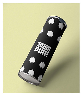
This approach involved playing with the design elements like a tank for the Nautanki and a bull from the Bulbul.
Take Ahead
Coding every packaging according to the T-shirt design is one way which will make it easier to know the product inside but according to the printing aspects and costing of
developing screen for each design is not viable.
Feedback
Packaging is a media of expression and this design does it but it also gives a feel that the brand is selling a pattern T-shirt or a boxer.
Concept 01
Concept 02
Identity
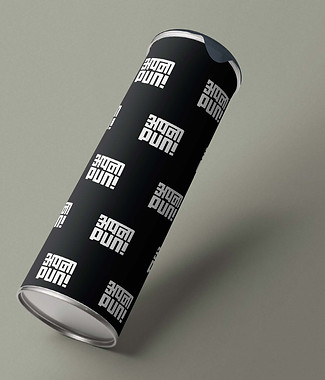
This approach involved playing with the logo as an element and keep it minimal yet bold, with the use of solid colours. The idea was to have simple designs, with clean information to bring focus to it’s importance.
Take Ahead
In this particular iteration the packging does justice to the brand promotion as it brings to notice the logo by repetation. The one thing still missing is the mood of the brand.


Concept 03


Pinwheel
A pinwheel as an element for depicting the mood of the brand that consists of a stick with brightly coloured pieces of paper at one end that turn around when you blow them or by holding the toy in the wind with a childhood association. It brings back childhood associations of a fair and playful characteristic along. The symbolic meaning of a pinwheel
is “to turn one’s luck around”. Chinese culture believes the pinwheel is an instrument to turn obstacles into opportunities and as such they are a revered symbol during Chinese New Year festitivies.
Construction

Lable Sampling
Taking inspiration of a pinwheel as a mood of a brand the palcement is in the form of doodle and scribble that we used to do on the wall in our childhood. Its the curiosity that
creates a playful surface of wall with a medium of joy (crayon, color pencils, pen etc. ) that transfers visualisation into an image with a smile and happy feel.
Keywords
Flow, Direction, Playfulness
The form of a pinweel has rounded corners as does the logo of the brand to create a family with similar elements of visual design. Taking our audience back to their childhood was our aim to create a fun happy feel, so a pinwheel rotating reverse has a hidden element to take one back in time and cherish the good old times.
Metaphorically pinwheel stands for:
Eye - text and visual
Ears - Words
Taste - after cracking the pun
Touch - organic feel
Smell - personal associations

Catering to the
childhood innocence,
unseen positive energy,
wish fulfillment &
transformation.


Placement of the Logo on the cylinderical surface is such that it does not disturb the other elements or vise-versa from at a time. The pinwheel as an element follows the gestalt principle to follow a pattern and let the eye flow in continuity.
After gone through numbers of testprints. We decided to do the UV screen for the pinwhile part.
The APNAPUN will be printed in Black.


